General
App Icon
The icon is too small
It doesn’t work in dark mode
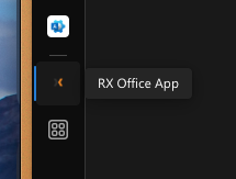
Let me know the required size & format for the icon and I can provide an image that will work better.
Navigation Menu
The dark mode on-hover background colour for buttons needs to be updated.
The selected page button (blue background) should not change when hovering.
The on-hover colour should be #EEE at 20% opacity (rgba(238, 238, 238, 0.20);)
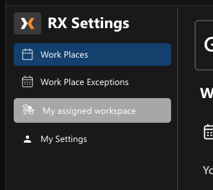
In dark mode, the navigation menu arrow button should have a dark background and a lighter arrow.
Left: screenshot from current app | right: screenshot from Figma mockup

Dashboard
Add an on-hover state to the Configure button.
This should be similar to the above style #EEE at 20% opacity (rgba(238, 238, 238, 0.20);)
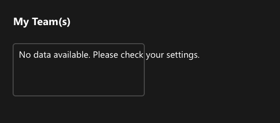
The empty team's box does not contain the “No data available” message.
It seems that the box width is based on a percentage of the total screen width, as it changes as the window is resized.
My Settings
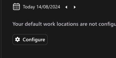
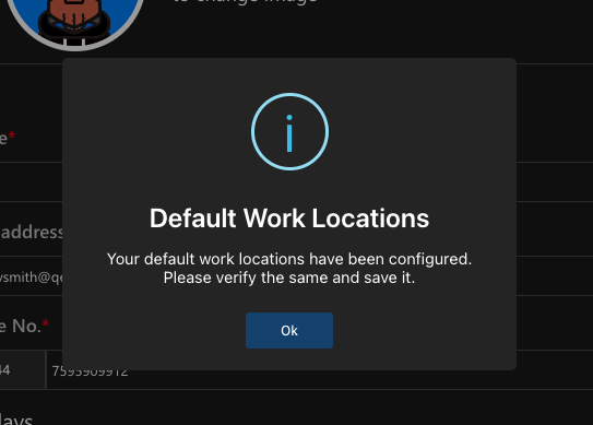
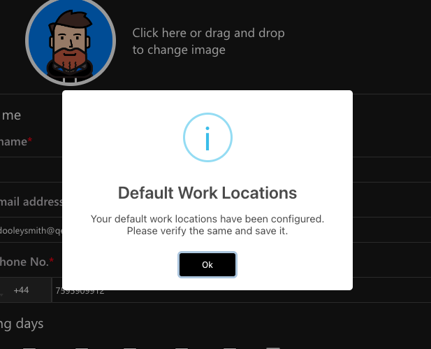
Default Work Locations Popup
Can we adjust the colour for dark mode?
In the below example I have change the background to #282828 text to #FFF and button to #124779.Change the wording used.
Your default work locations have been automatically configured.
Please verify and save.
My Settings Page
Adjust the hover state for the action button.
This should match the above recommendation #EEE at 20% opacity (rgba(238, 238, 238, 0.20);)
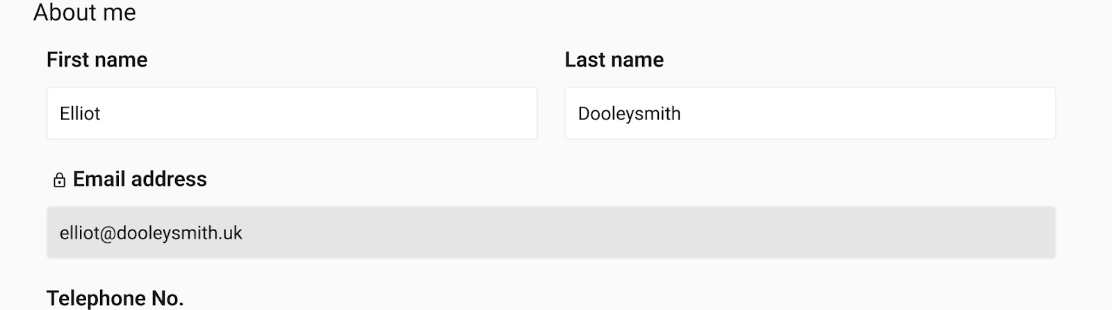
Locked fields should have a slightly greyed-out background.
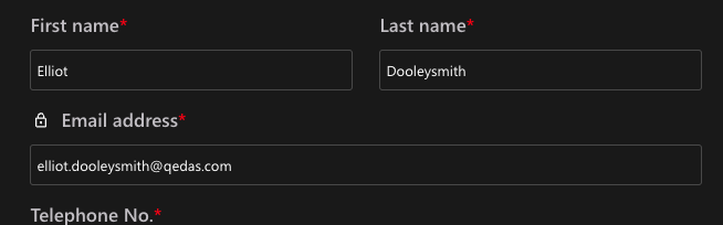
For Dark mode this should be #FFF at 10% (rgba(255, 255, 255, 0.1);)
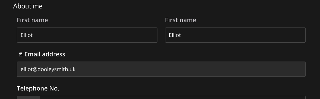
For Light mode this should be #282828 at 10% (rgba(40, 40, 40, 0.1);)
Can the unchecked tick boxes be shown with a dark/transparent background with a lighter border?
See example from Figma mock up
The Default work location time field cuts off the value when the page is narrow.
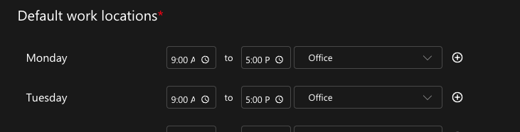
Can there be a set min-width for these fields so that the time value will also be fully visible?
The check box on the “Delete this data” popup is black in dark mode which makes it difficult to see.
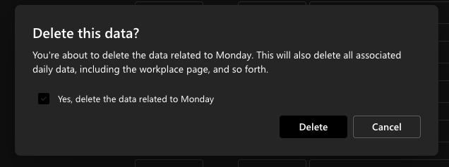
Can the checkbox be changed to white when ticked?
Update the text “No data available. Please check your settings.”
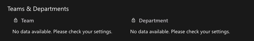
For the locked fields Teams, Departments and Access Settings this should be updated to:
No data available. Contact your administrator to update these settings.
The date format option wraps the text when viewed in a narrow window.
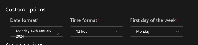
Can this text be set to no wrap with overflow hidden?
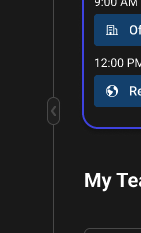
Dashboard
Similar to above the dark mode on-hover needs to be updated for any action buttons, this includes the date arrow buttons, the “Today” button and the “Add” buttons.

The date arrow buttons need to have to have a larger negative space.
As shown in the below screenshot, the “Today” button is very close to the right arrow button.
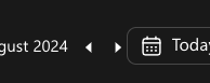
There is also no on-hover state for these buttons.
See the example from the mockup showing the right arrow in the hover state, it should be a larger square with rounded edges that are visible when hovered.
In dark mode, the dash between the time values is not coloured white, and can’t be seen.
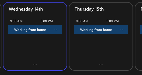
Can the time text values be made larger, maybe font-size 14px or 16px;
Adjust text alignment for the time values.
The time values look a bit randomly floating. Can they be adjusted to be aligned left, with ample negative space?
They should also have an on-hover state (following the same on-hover rules as elsewhere), and the hit area should have a slight padding with rounded edges, as indicated by the “12:00 PM” value shown in the image below.

The greyed-out past days should be a lighter colour. This should match the background colour for the locked fields.

For Dark mode this should be #FFF at 10% (rgba(255, 255, 255, 0.1);)

For Light mode this should be #282828 at 10% (rgba(40, 40, 40, 0.1);)
